A New Way to Analyze Color’s Impact on Ad Performance

Why Color Matters in Advertising
As anybody who has ever participated in any sort of logo or branding exercises knows, color selection is a huge factor of an organization or product’s brand identity. After all, the world is full of color and the ways in which we perceive color determine our emotional responses and associations. The idea of Psychology of Colors in Marketing is not at all new, either, and has been studied extensively over the years.
Color appears to our visual senses, naturally, which then triggers various reactions in the brain, and marketers learned to capitalize on these shared stimulations by choosing brand colors that generally elicit specific responses. Need visual proof? Just look at The Logo Company’s frequently shared Color Emotion Guide, which groups logos by color and their common associations.
Ever wonder why so many social media companies choose blue brand colors? Blue is associated with trust and dependability. How about the use of yellow by everything from furniture and electronics stores to restaurants and food brands? Yellow prompts optimistic reactions.
Because color is such an important aspect of brand identity, it’s also a key component in understanding relevant features of a video and how viewers will ultimately interpret a company’s ads. Each and every day, we look for ways to make our creative data set more robust by surfacing even more interesting and relevant data. Extracting color information seemed like an obvious next step in our quest to propel the the rise of Intelligent Creative.
How We’re Incorporating Color into Creative Insights
We’re introducing color as a new Creative Element for analysis, accompanying Emotions, Objects, People, and Text. Wherever you currently see Creative Elements, be it in the Creative Manager or in the Insight Stream on your Dashboard, you may now see Color. But, just like the other Creative Elements, how we analyze Color will be far more nuanced than simply “this ad contains the color red.”
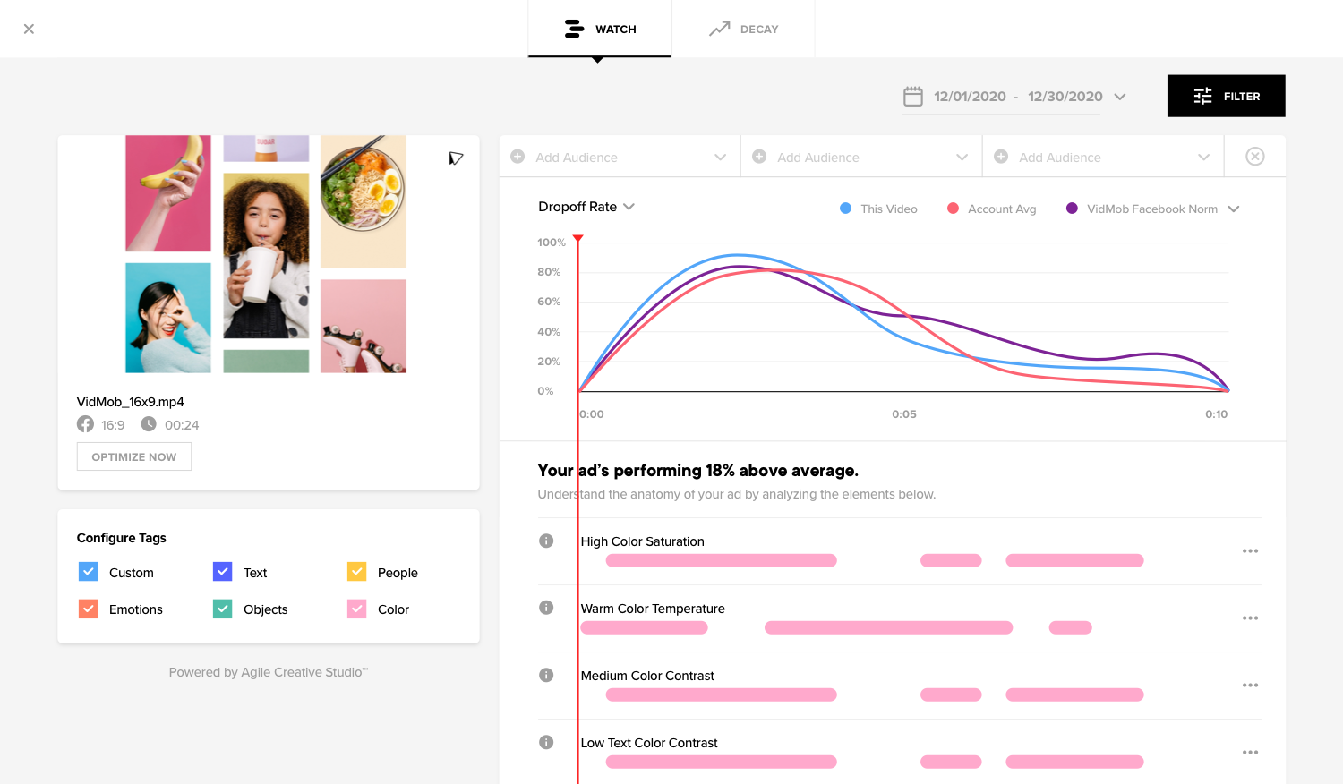
Here’s how we’ll break down the many use cases of Color for analysis:
- Vibrancy: How ‘colorful’ an image is as defined by brightness, saturation, and variability of the color in an image
- Temperature: How warm/cool an image is, where ‘warm’ is defined by how red-toned an image is and ‘cool’ is defined by how blue-toned an image is
- Color Contrast: The overall contrast of an image, determined by the difference between color and brightness among all the objects within the same frame
- Text Contrast: The contrast between text against the background, defined similar to Color Contrast, comparing the color of the text on all the objects within the frame
- Dominant Color: Uncovers the color that is most dominant in a given frame by translating the hex code to a color
Layered with the other insights available in Creative Studio, Color elements are intended to help you identify how your use of color is helping or hindering your ad performance.
What’s to Come with Color at VidMob
We’re just getting started with Color as part of VidMob Creative Insights. As we continue to build on the feature, we explore ways to expand our approach to Color in ways that support brand safety and compliance.
Want to see Color in action? If you’re an existing VidMob client, visit your Creative Manager, or reach out to Get a Demo.
Most Popular


Designing Creative for the Multichannel Experience
popular_posts_widget Read MoreMost Recent


